So after a little while, I came across an interesting piece of artwork by the African artist Fikru G. Mariam. Most of Fikru work involves women faces painted in elongated and abstract ways on an oil canvas but the work I have chosen for today stands out among all the rest. Why does it stand out so much you ask? well, the painting below is what 70% of his work looks like, but the piece I choose has a very different style to it.
Adewa, woodcarving, 1996
The piece I chose is titled Adewa and it is a wood carving made in 1996 by Fikru G. Mariam It stands out so much from the other work that it looks like another artist carved this. Getting off that topic; now I want to talk about this piece. First off, the detail on this piece of work is truly staggering. The horses in their reigns have a very detailed mouthpiece and on their lower body jewelry and emeralds to boot. The people in this painting are all carrying something to defend themselves like bow and arrows, and shields which leads me to believe that this painting is about a great general controlling his army. Now the contrast of light and dark used in this painting I find most interesting because it gives off the illusion of depth. I also really liked the sun and the mountains carved in the background. This carving uses the lights and dark’s so well that it gives off a really cool effect.
Now like I said before the person who carved this was Fikru G. Mariam. He was born in 1973 and has been practicing art since he was 11. In 1995 he graduated from the School of fine arts and he then dedicated most of his time to painting. At that time he painted mostly about religion and different African themes. These days Fikru spends his times in Addis Abeba and Paris. His work despairs all over the world including Italy, the United States, Canada, and the Netherlands.
I love the color that he uses in his artwork and the different shapes. You are able to see all the different shapes he uses. He uses such bright colors in his paintings. I’ve provided a video of some of his artwork that he has done. Fikru found his inspiration painting elongated women’s face after he had traveled the Harrar area. What inspired him was the women there. He loved the way they dressed and did their craft. I would love to own some of his paintings because when I look at them I feel happy. The colors and just from where he gets his inspiration from.
I love how Christo Jeanne Claude pay for their own projects through the sale of original works to museums, private collectors and galleries. The artists don’t accept any sponsorship. The wrapped trees started on November 13, 1998. They had wrapped 178 trees with woven polyester fabric. I also find really interesting how they came to “The London Mastaba.” I have provided a video that goes into detail. This started all the back around 1958 where he started out with small cans. The video even talks about when he started to do his sculpture in barrels in the lower garage that he rented. They really had very interesting ways of creating art. I like looking at the different things they did. Compared to other artists I feel this is very unique. If there were paintings I would love to own a painting of the “Wrapped Trees.”
Judy Baca
Danza de La Tierra
January 1, 2010
“The subject of the mural is movement and dance set in the city of Dallas. Baca says to “to elicit the illusion of movement, the bones of the mural or its underlying geometric compositional lines are composed of swirling ellipses. The dancers are seen as multiple images as they move through space. The design is carefully planned to draw the viewer into the dance as a participant in movement as they travel through the lobby of the Cultural Center to view a performance.”
“Triumph of the Hearts” by Judy Baca 1986-2003
Through her art, Judith Baca tried to demonstrate ways in which public art can create alliances within a marginalized community and also serve as an advocate for social change. After college, she worked on a collaborative mural project that intended to better the problem of gang violence in Los Angeles. Judy Baca is an artist who has stood for art in service of equity for all people. She is the founder of the first City of Los Angeles Mural Program in 1974. This later became a community arts organization known as Social and Public Art Resource Center. Her murals and public art focus on revealing and reconciling diverse peoples struggles for their rights and affirm the connections of each community to that place.
“The World Wall: A Vision Without Fear” is a traveling mural installation design by Judith Baca, that currently involves eight different panels. The mural is sponsored by the SPARC. The World Wall has traveled from the United States to Finland, the Soviet Union, and Mexico. Four of the panels, ”Triumph of the Heart”, “Nonviolent Resistance”, “Balance”, and “Triumph of the Hands” have been done by Judith Baca
I really love her artwork because I love how she focuses on diverse peoples struggles for their rights. She is an artist that I really admire for what she is doing to help people. I love seeing the emotions in her paintings. For instance, the “Triumph of the Heart” you can see the women’s tears. Through this, it shows how society seeks peace in their communities. I would love to own both of these paintings that I have presented here.
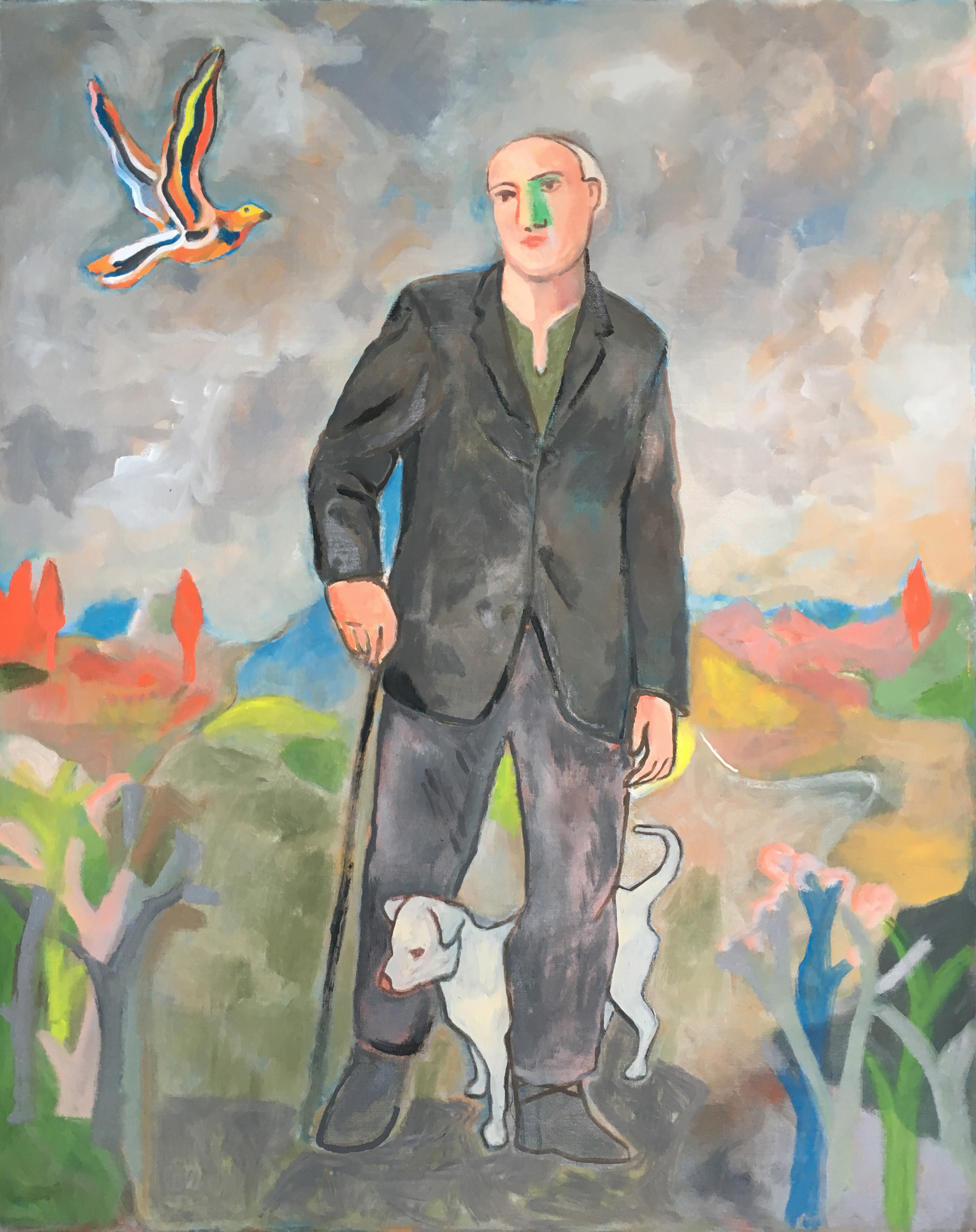
Sandro Chia
Water Bearer 1981
The Wayfarer with His Cane (Dog In Italian) 2017
Sandro Chia is an artist of the movement in Italian figurative painting known as the Transavanguardia. In his paintings, you are able to see how he celebrates man’s sensuality, vitality, and relationship with nature. I’ve noticed that in a lot of his paintings he uses grey and vibrant colors. I haven’t really understood too much what each painting means, but I like looking a the detail and the colors used in these paintings. I don’t I would really own a copy of any of these paintings. You also seem to see in his paintings he uses men or boys traveling. I don’t think I would own any of these paintings. I think it’s because I don’t really know the story behind them.
The Early 20th Century is called The Age of Anxiety or the age of crisis. The most important event in this century was World War I, which caused a lot of deaths than all others put together. The paintings during this time were very interesting. It is interesting to see the story behind them and the artists.
I chose the painting “Starry Night” by Vincent Van Gogh. This painting really caught my eye the way that he uses color in this painting. This painting was done from Vincent Van Gogh room while he was in the asylum. “Several months after painting Starry Night, Van Gogh wrote: “Why, I say to myself, should the spots of light in the firmament be less accessible to us than the black spots on the map of France?… Just as we take the train to go to Tarascon or Rouen, we take death to go to a star.” I love the way this video describes this painting. He painted this painting in 1889. He got this inspiration through nature. He had written letters to Tao talking about the different animals, plants etc. on his walks. He got his influences in color in his paintings when he lived with his brother in Paris. This is where he was exposed to Impressionism. I love how she describes the colors in this painting to be ablaze. How it’s a mixture of blue, orange, and yellow colors. I also love how she goes into talking about the bright star which Vincent believed it was the “Morning Star.” This is a painting I would own a copy of. I just love the story behind it and enjoy the colors he used.
The painting “The Persistence of Memory” by Salvador Dali. Hard and soft used in the painting. In the background of the painting, you see the cliffs which are where he is from. She talks about how they are permanent and how time is supposed to be permanent too. I found it interesting when she talked about Salvador Dali going into a state when it came to doing his work. I wouldn’t own a copy of this painting. I find it interesting but for me, it’s not something I would love to have in my home.
“I have a sort of inner conviction that for all the possible limitations of my mind and the disturbing effects of my processes, for all the contradicting struggles and failures I have gone through, I have come to something that is in the image of America and the American people of my time.” Thomas was a regionalist painter and he spoke through his paintings. This painting “Cotton Pickers” by Thomas Hart Benton painted this picture when he made a trip to Georgia in the late 1920’s. Looking at this painting you can tell they are slaves picking cotton on a hot day. You even see a child laying down as their parents are working on the field. This painting showed what he believed that African American history was central understanding of the American culture. I like how he based his paintings on how he used them to protest KKK, lynching, and fascism during the 1930s and 1940s. To me, this is amazing because he spoke out through his work. This is a painting I would own. I love how the painter used his paintings to speak out.
Albert Bierstadt, Among the Sierra Nevada Mountains, California, 1868
I really enjoy Hudson River School art. To me, this is art that I can appreciate the landscape. I love how detailed the art is and the colors used. The Hudson River School was “a mid-19th century American art movement embodied by a group of landscape painter.” The artistis were influenced by Romanticism. The artists focused their paintings of the Hudson River Valley, Catskill, Adirondack, and the White Mountains. Second generations included New England, the Maritimes, American West, and South America. The paintings are so amazing looking at different landscapes from different parts of the world.
In this video description video of the painting “Among the Sierra Nevada Mountains” was a very amazing way of looking at the photo. The way they describe the clouds and how it looks like the storm is leaving or coming in and how it belongs, the description of the water, mountains, and the animals in their environment.
This painting “Mount Corcoran” brought me backing to thinking of Juneau, Alaska. Once I saw this I just started to imagine all the scenery that I got to enjoy while living there and the animals. In this picture, you can see the glossy water and snowy peaks. You are able to see the detailed work that he did and how smooth the surfaces look. I find it so beautiful how clear the water looks where you can see rocks underneath the surface. I would own both pieces of work in my home because I love nature artwork and I love how these have so much detail and just makes me feel like I am actually there.
Impressionism
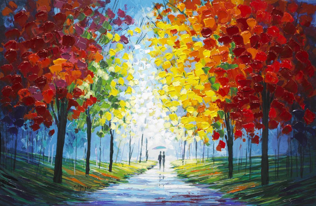
When it comes to Impressionism, I am in between liking and disliking this type of style of artwork in the Romantic era. There are some paintings I feel have such beautiful bright colors and the texture that shown, but at the same time, I feel that there are other paintings that just don’t have a lot of details and the colors to me seem very blunt. I will show you two different types of paintings that will show what I am talking about.
This painting is something that I really enjoyed due to the bright colors. Looking at this painting I feel that this is in the fall because of the choices of colors chosen for the leaves. Usually during the fall is when the leaves start to change in color. You are able to see this couple taking a stroll through a park where you see the pathway is wet due to rain. You can see the rain depicted in this painting and you can tell because the couple is carrying an umbrella. “The Impressionist painters sought to break away from the illusion of reality in painting, and to allow painting to become “paint-ing” – that is, no longer smoothing out surfaces, allowing brush strokes to become visible, and even, in some cases, to allow the raw canvas to remain exposed.” In this painting is where I like how the painter didn’t smooth out the leaves on the trees. To me, this is a beautiful way of getting the leaves to stand out beside the bright colors that were used. The painter of this painting, Llyayev, favors emotive color and he focuses on texture and the painting surface. “He has arrived at a new and very unique synthesis, placing his own stamp on these pictorial innovations. Looking at his artwork, he seems to use the colors, red, yellow, orange, and blue as his main colors. In a lot of them too he uses the same couple a lot carrying an umbrella. This is a painting that I really enjoy and something I would own in my own house.
“A Venetian Backwater” by Fritz Thaulow
“A Venetian Backwater” painting is an example as to why I dislike Impressionism. Looking at this painting compared to the other one, the colors are so dull and the style of painting this picture to me just doesn’t have a lot of detail and also seems unfinished. This is a painting that I wouldn’t own in my own home at all. This is why that I am in between liking Impressionism style of art. I am someone who loves bright colors and detail.
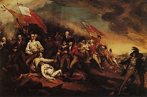
Title: The Death of General Warren at the Battle of Bunker’s Hill, June 17, 1775
Artist: John Trumbull
Date: after 1815–before 1831
Location: Boston
The Americans won their freedom from the tyranny of Britain and this was portrayed in the art created at the time during the 18th century. Many artists during this time included John Trumbull, Gilbert Stuart, and John Singleton Copley. These artists incorporated Classical style into their work ranging from Rococo to Neoclassicism. The artists practiced realism in their portraits and re-creations of battle scenes. The above painting, “The Death of General Warren at the Battle of Bunker’s Hill, 17 June 1775” by artist John Trumbull is in the Neoclassical style. This painting is of the actual battle scene that Trumbull witnessed looking through field glasses. A lot of the artists during this time used their art to express the history taking place during this time but, also expressed their political views and opinions. In this painting, the focus is on Warren’s body in white and British Major John Small and there are several soldiers from both sides of the battle holding onto several flags. One detail that I noticed in this painting is how the dark clouds in the upper right of the painting seem to overshadow the British while there is more of a light that shines down on the colonists. I don’t think I would own a copy of this painting at home. I love the backstory behind it, but it’s not a painting that I would have hanging on my wall.
Title: The Lansdowne Portrait
Artist: Gilbert Stuart
Year: 1796
Created: Philidelphia
Gilbert Stuart was a Portraitist whose dream commission was the opportunity to paint George Washington. He painted several portraits of George Washington focusing on the “differing image, quality, and purpose” each time. “The Lansdowne Portrait” is an oil on canvas that was commissioned by Senator William Bingham of Pennsylvania 1796. In the painting, George Washington is surrounded by the symbolism of both American and Ancient Rome in design. George Washington is dressed plainly in a black velvet suit with his hand outstretched. There are Doric columns in the background, and instead of holding a battle sword, George Washington is holding a decorative sword that symbolizes, “a democratic form of government, rather than a monarchy or military dictatorship.” If you focus on the top circular section of the chair the colors, stars and stripes of the American flag are depicted. The clouds on the left side of the painting and the rainbow on the right symbolize the American Revolutionary War changing to peace in the United States after the signing of the 1783 Treaty of Paris. I like how this picture is depicted but I don’t think I would own this painting in my house.
Title: Abigael Bromfield Rogers (Mrs. Daniel Denison Rogers) (1753-1791)
Artist: John Singleton Copley
Created: 1784
Location: North America, United States
John Singleton Copley was a famous American born artist known for his portraits. He was particularly fond of painting portraits of the middle-class in Colonial New England. Copley was known for incorporating the Rococo style. This can be seen in one of his paintings of, “Mrs. Daniel Denison Rogers” with the pastel colors in the sky and in the shimmering of her dress. He did such an amazing job with this painting. Looking at it the painting makes me feel like I can feel the silkiness of the dress. The details in the lace of her hat, her facial features, and the use of flesh tones are all traits that Copley was known for. I feel that I would own this art picture in my house if I had a theme going on. I just love how real this picture is depicted and I love the sunset in the background. I feel that the colors of the sky make her dress standout.
Harvard. (n.d.). Harvard Art Museums / Fogg Museum | Bush-Reisinger Museum | Arthur M. Sackler Museum. 18 October 2018. Retrieved from https://www.harvardartmuseums.org/art/227926
I chose this painting because I like how it makes me feel inside. I see a lot of happy emotions. This painting was painted by Nicolas Lancret. He was known for his small-scale paintings of elegantly dressed aristocrats in playful engagements. Nicolas Lancret painted portraits of actors and actresses where he would show them on stage or in performance. This portrait is of Marie-Anne Cupis de Camargo, who is a famous dancer. She introduced countless breakthroughs to the ballet. She introduced the ballet pumps that the dancers are using today, new steps, pirouette, and fouette. In this painting you can see how Lancret represented her dancing lightly, paying attention to her outfit and musicians on stage surrounded by the scenery. You are able to see the soft poetic landscape background, golden coloring, and the expressive movements that Marie-Anne Cupis de Camargo.
This work of art is an influence of royalty. Baroque dance was developed in France at the court of Louis XIV during the Baroque period. During this period, the French culture was highly influential in up-to-date society and the new style of dancing. The new style of dancing was introduced by Charles II, which then French dancers were employed at theatres and courts throughout Europe.
I feel that I would own a copy of this painting. This painting depicts a lot of feelings when I look at it. I am able to see love, happiness, and enjoyment of dancing. The colors used in this painting also does show me these emotions. That golden coloring in the painting for me is what brings out the emotions in her dancing, movements, and the others in this painting.
I decided to choose artwork by Heironymus Bosch because I found his art very interesting. I have never seen such artwork before. When looking at his work there is always so much going on. I love zooming into his work and looking at every detail there is. I really admire his work and would love to read more on his other paintings and learn the backstory of them. This is a piece of artwork can be found in Museo Nacional Del Prado created between 1503 to 1515 during the Northern Renaissance.
This painting in the first panel shows the influence of heaven, the descent of divine impact, and Earth. The second panel of the painting shows heaven and birth into the earthly sphere, the wheel of life, and earth the symbol of the senses. The third panel shows the highest level is in the front, and one goes down into hell as one moves up into the distance in the visual field. I don’t think that I would actually own this painting. I chose this painting because I find Bosch’s work very interesting and weird in a way. I think is what caught my eye and why I chose this painting. His work really strives me to look into more artwork looking at the world through his eyes.
I chose this painting by Barbara Meikle because I loved the colors she used and the landscape she chose to paint. You can see how this painting was done in the morning at the Abiquiu Oasis. You are able to tell this by the pink and blue color she uses for the sky. Throughout her painting, you can see the vibrant colors she uses blue, pink, and yellow. This painting makes me feel happy inside and appreciative of the greater outdoors. She painted this picture this year in July. I love how she uses the greater outdoors just outside of where she resides. Barbara Meikle gives drama and brilliance to the land that most of us wouldn’t see looking at land.
Barbara Meikle has really opened the way I see the landscape. Having the chance of going to New Mexico this past week, I have been able to really appreciate landscape more and see it the way she does. It makes me all happy inside and I really look at the colors instead of just looking at the dirt and grass. Just looking at the picture makes me feel warm inside and happy.
My name is Samantha Abeyratne. I was born in West Palm Beach, Florida and have lived in so many other states. I moved to Kotzebue, Alaska when I was 14 years old and actually appreciated it more as I grew up. I am recently married as of August 18th. We have a beautiful little girl who is a year and a half. We also have a dog that we love to take out on our explorations. I am working towards finishing up my BA in family studies. I can’t wait to graduate so that I can start helping children and families in different areas and just being able to be there for someone and watching them grow.
This work of art is something that appeals to me. The colors that Barbara Meikle uses in her fine art. She creates colorful and whimsical artworks in both her oil paintings and bronze sculptures. I love how she uses animals in her artwork to help donate money in support of local and national horse, donkey and wildlife rescues.
Honestly, my relationship to art has never been so big. I mean I have done DIY for home stuff and have even done art projects with my little kiddos in class, but have never really gotten into art so much. After I discovered Barbara Meikle, she has actually turned my perspective of art around. I am going to be heading to New Mexico in the next couple of days and I can’t wait to actually go to her art gallery in Santa Fe and embrace the work she has done.